Thursday, 12 February 2015

ROLEX


Shape of the Rolex Logo
The name “Rolex” is said to be inspired from a French phrase “houloguorie exquise”, which means exquisite. The iconic Rolex logo comprises of a pointed crown symbol as the company’s slogan is “A Crown for every Achievement”. A crown symbolizes prestige, victory and perfectionism – something Rolex has always strived for and prided itself on.
Colors of the Rolex Logo
While the gold color in the Rolex logo depicts excellence and rich tradition of the watchmaker, the green color represents uniqueness and prosperity.
Font of the Rolex Logo
The Rolex logo features a slightly modified form of Garamond typeface.

Friday, 30 January 2015

Research


                               STARBUCKS

DESIGN ELEMENTS OF STARBUCKS LOGO

The Starbucks logo is based on the 17th century “Norse woodcut” which is topless with her double fish tail fully visible. The logo then evolved with her breasts covered by flowing hair but navel still visible. The third version saw the disappearance of her breasts and navel from the logo with only the fish tails remaining visible.Earlier this year, the world’s largest coffeehouse chain announced the removal of Starbucks wordmark above the siren and enlarging of the siren figure.
SHAPE OR THE STARBUCKS LOGO:
The Starbucks logo is circular in shape along with another circle within it. The wordmarks are inside the circles with two stars on either sides separating the words Starbucks and Coffee. The current change to the logo is a bid to highlight the Siren which is a symbol of the Starbucks’ legendary taste.
COLOR OF THE STARBUCK LOGO:
The two-colored Starbucks logo characterizes the simplicity of the brand. White and deep green are the only colors that are used in the new logo. The two tails are white in color whereas green forms the background of the logo.
FONTS OF THE STARBUCKS LOGO:
The former Starbucks logo sported a bold but simple font that attracted all age groups. The new logo is without any wordmarks or stars with an enlarged siren.
The Starbucks Coffee is known for its unique taste, quality and customer-friendly atmosphere which firmly roots the company in the world of beverages. The Starbucks logo is purposefully legendary which gives a new dimension to its products and enables them to reach the zenith of success and win customers’ trust.


Tuesday, 30 December 2014

Colour study final assignment


This is the shirt that i have designed.I have given many choices such as punky,retro,sporty,haute couture and vintage but  finally I decided to design Retro.Why I choose retro?because retro fashion and it's colour look more attractive and cheerful  than other.

  I have used many colours during design this t-shirt.First i used pink colour and it's means love and tenderness.This pink colour make myself happy and feel free.Second i used peach and it's means good luck and courage.This colour make myself calm and if I failed to do something I feel to try harder.I like peach colour.I design this using poster colour then make polka dot on the shirt.

 The type of shirt that I used is cotton because it's more comfortable to wear.Lastly this t-shirt suitable for teenager because they will look more energetic.

final project


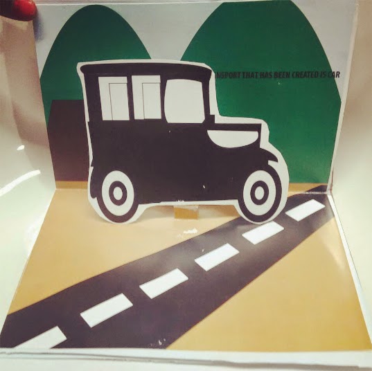
 MY POP UP BOOK


final project progress 2


TEST PRINT


final project progress 1