Tuesday, 30 December 2014

Colour study final assignment


This is the shirt that i have designed.I have given many choices such as punky,retro,sporty,haute couture and vintage but  finally I decided to design Retro.Why I choose retro?because retro fashion and it's colour look more attractive and cheerful  than other.

  I have used many colours during design this t-shirt.First i used pink colour and it's means love and tenderness.This pink colour make myself happy and feel free.Second i used peach and it's means good luck and courage.This colour make myself calm and if I failed to do something I feel to try harder.I like peach colour.I design this using poster colour then make polka dot on the shirt.

 The type of shirt that I used is cotton because it's more comfortable to wear.Lastly this t-shirt suitable for teenager because they will look more energetic.

final project


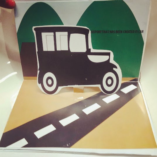
 MY POP UP BOOK


final project progress 2


TEST PRINT


final project progress 1


Tuesday, 23 December 2014

colour toning


Split complementary and colour harmony

Split Complementary.
- Colour scheme is a variation of the complementary colour scheme. 
- Has the same strong visual contrast as the complementary colour scheme but has less tension.
It uses the two "Analogous" colours adjacent to its complement.


Colour Harmony.- Nature's way of saying that two or more things together make sense.- Represents a satisfying balance or unity of colours.


FINAL PROJECT(INK+WATERCOLOUR)

1.First i sketches for my design.I make a globe


2.Second i coloured it using watercolour.i used 3 different colour which is green,blue and brown.


3.Third i use art line pen to do the touch up to make it look more interesting and attractive/