Thursday, 7 May 2015

OGILVY & MATHER

WHO IS HE?
-Ogilvy & Mather is one of the largest marketing communication companies in the world.It is was named the Cannes Lions Network of the year 2012 and 2013.In 1948,we were founded by David Ogilvy,who wanted to build a different kind of company from the beginning.Starting with zero clients,two employees and huge ambitions,David built a world class agency by hiring ambitious and diverse people who cared deeply about the quality and class of his business.

WHEN HE STARTED?
-Ogilvy & Mather was founded in 1948 by British born David Ogilvy,with backing by a previous employer,the London advertising agency Mather & Crowther.Mather & Crowther  originally sent David Ogilvy to the United States in 1938.Ogilvy in 1948 started at U.S agency with the backing of Mather & Crowther,who by then had merged with the U.K based Benson agency group.Ogilvy was acquired by the WPP Group in 1989 for $864 million.

WHAT HE DOES?
-Over the past 60 years,they were serviced Fortune Global 500 companies and local business through our international network.In the process.we've helped to build some of the most recognizable brands in the world including American Express,Sears,Ford,Shell,Dove,IBM and Kodak.Today,their company is divided into a number of specialty units in the following fields:advertising,public relations and public affairs,branding and identity,shopper and retail marketing,healthcare communications,consulting,research and analytic capabilities,direct,digital,promotion and relationship marketing.

Friday, 27 March 2015

MOCK UP STATIONARY


Reference for mock up stationary


THE PROCESS MAKING STATIONARY ITEMS


Finished

Thursday, 26 March 2015

LOGO DESCRIPTION


Logo Description


I have decided to make watch company for my assignment.I name it GOLD because people said "time is precious as gold".
This is my logo for my watch company.I make my logo using my own typo based on my   references.My logo mostly looked it the inside of a watch.
The colour that i used for my logo is"Gold".I choose this colour because it represented luxury and rich.

ILLUSTRATED LOGO


Illustrated logo in AI


This is the process when i colored my logo


DONE

Saturday, 21 March 2015

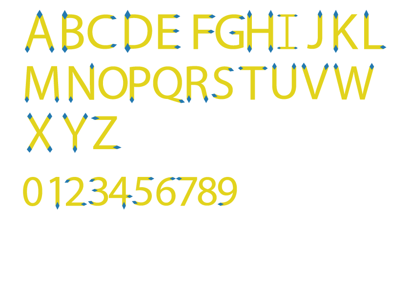
TYPOGRAPHY FONT 1

TYPOGRAPHY FONT 1

SKETCH FOR TYPOGRAPHY ASSIGNMENT

PROCESS  MAKING FONT IN ADOBE ILLUSTRATORS


FINISHED


Thursday, 12 February 2015

ROLEX


Shape of the Rolex Logo
The name “Rolex” is said to be inspired from a French phrase “houloguorie exquise”, which means exquisite. The iconic Rolex logo comprises of a pointed crown symbol as the company’s slogan is “A Crown for every Achievement”. A crown symbolizes prestige, victory and perfectionism – something Rolex has always strived for and prided itself on.
Colors of the Rolex Logo
While the gold color in the Rolex logo depicts excellence and rich tradition of the watchmaker, the green color represents uniqueness and prosperity.
Font of the Rolex Logo
The Rolex logo features a slightly modified form of Garamond typeface.

Friday, 30 January 2015

Research


                               STARBUCKS

DESIGN ELEMENTS OF STARBUCKS LOGO

The Starbucks logo is based on the 17th century “Norse woodcut” which is topless with her double fish tail fully visible. The logo then evolved with her breasts covered by flowing hair but navel still visible. The third version saw the disappearance of her breasts and navel from the logo with only the fish tails remaining visible.Earlier this year, the world’s largest coffeehouse chain announced the removal of Starbucks wordmark above the siren and enlarging of the siren figure.
SHAPE OR THE STARBUCKS LOGO:
The Starbucks logo is circular in shape along with another circle within it. The wordmarks are inside the circles with two stars on either sides separating the words Starbucks and Coffee. The current change to the logo is a bid to highlight the Siren which is a symbol of the Starbucks’ legendary taste.
COLOR OF THE STARBUCK LOGO:
The two-colored Starbucks logo characterizes the simplicity of the brand. White and deep green are the only colors that are used in the new logo. The two tails are white in color whereas green forms the background of the logo.
FONTS OF THE STARBUCKS LOGO:
The former Starbucks logo sported a bold but simple font that attracted all age groups. The new logo is without any wordmarks or stars with an enlarged siren.
The Starbucks Coffee is known for its unique taste, quality and customer-friendly atmosphere which firmly roots the company in the world of beverages. The Starbucks logo is purposefully legendary which gives a new dimension to its products and enables them to reach the zenith of success and win customers’ trust.