Tuesday 30 December 2014

Colour study final assignment


This is the shirt that i have designed.I have given many choices such as punky,retro,sporty,haute couture and vintage but  finally I decided to design Retro.Why I choose retro?because retro fashion and it's colour look more attractive and cheerful  than other.

  I have used many colours during design this t-shirt.First i used pink colour and it's means love and tenderness.This pink colour make myself happy and feel free.Second i used peach and it's means good luck and courage.This colour make myself calm and if I failed to do something I feel to try harder.I like peach colour.I design this using poster colour then make polka dot on the shirt.

 The type of shirt that I used is cotton because it's more comfortable to wear.Lastly this t-shirt suitable for teenager because they will look more energetic.

final project


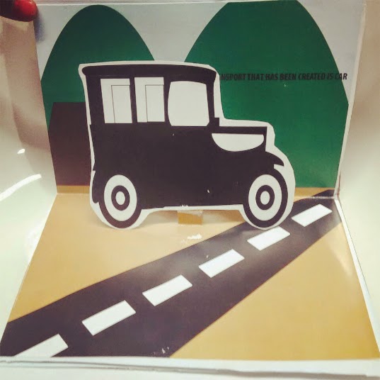
 MY POP UP BOOK


final project progress 2


TEST PRINT


final project progress 1


Tuesday 23 December 2014

colour toning


Split complementary and colour harmony

Split Complementary.
- Colour scheme is a variation of the complementary colour scheme. 
- Has the same strong visual contrast as the complementary colour scheme but has less tension.
It uses the two "Analogous" colours adjacent to its complement.


Colour Harmony.- Nature's way of saying that two or more things together make sense.- Represents a satisfying balance or unity of colours.


FINAL PROJECT(INK+WATERCOLOUR)

1.First i sketches for my design.I make a globe


2.Second i coloured it using watercolour.i used 3 different colour which is green,blue and brown.


3.Third i use art line pen to do the touch up to make it look more interesting and attractive/

Development process

making our own logo from 2D to 3D design.First do the quick sketches.Then apply shape and after that,making a box to do 3D.After finish,use artline to do the outline.

RENDERING SHADING TECHNIQUE


HATCHING 

Hatching is an artistic technique used to create shading effects by drawing.


CROSS HATCHING

Cross hatching is an extension of hatching,which uses is the use of fie parallel lines drawn closely,to create the illusion of shade or texture. 


CONTOUR HATCHING

Contour hatching is a line that follow the contours of objects.


SCUMBLING/RENDOM

It is a large or small form to be made the shade in the objects.


STIPPLING/DOTS
Stippling is the creation of a pattern simulating varying degrees of shading by using small dots.

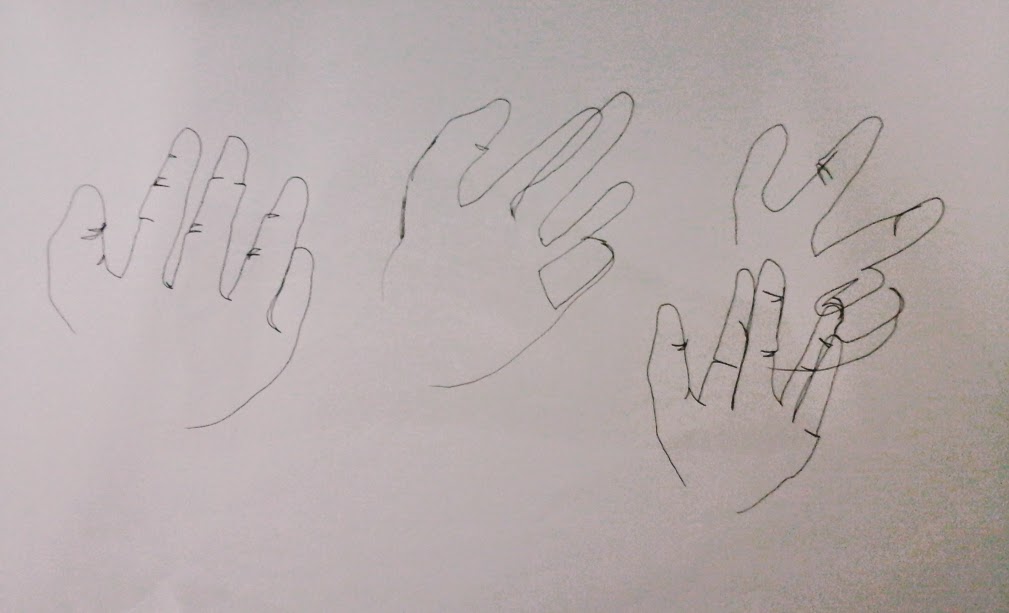
Contour,blind contour and gesture drawing


CONTOUR DRAWING


SUBJECT MATTER(SHOE)


LANDSCAPE

make this using art line and Chinese ink. 


Sunday 14 December 2014

IDEA FOR POP UP BOOK

My idea for the final graphic design project is the evolution of transport.This project I created this using AI and A5 paper in the form of 2D.

Fisrt I sketch the transport.


After sketch i try to make a  mo cap for the project


Tuesday 2 December 2014

COLOR VALUE

COLOR VALUE

Color value refers to the lightness or darkness of a color. Value becomes critical in a work which has no colors other than black or white. Every color can produce a variety of tones; how light or dark these are depends on the color.

These are the color value that we make using primary color; YELLOW, RED, BLUE. Starts with the color, we keep on adding white color to get the lightest color. 


COLOR TEMPERATURE

COLOR TEMPERATURE

Color temperature describes the degree of warmth visually found in a color. Color temperature divided into two groups, warm colors and cool colors.
WARM COLOR
- A color that gives the viewer a sense of bright, warmth, energy, heat, such as the colors of the sun.


COOL COLOR
- A cool color gives a sense of calm, coolness, cold, stillness, such as the colors of the ocean.